









Since the very first Galaxy Fold, Samsung has made it clear that it believes the future of mobile computing lies within handsets that can shape-shift from regular slabs to large-screen tabs.
The Z Fold experience is one that keeps giving, with new use cases and software tricks that unravel as you flex the device throughout your daily life.The Galaxy Z Fold 4 is the company's latest attempt at convincing the masses that foldables are the real deal. Four years in, there's a lot that Samsung still has to get right with the Z Fold. And even though the folding phone market remains one that is lacking in competition, there are high expectations for Samsung to finally give its flagship foldable the push it needs to warrant the price it demands.
While this review covers my month's time with the Z Fold 4, exploring its design elements, software experience, and stand-out features, I'll be putting the handset through its rounds over the course of the year and updating you, readers, segment by segment, day by day.
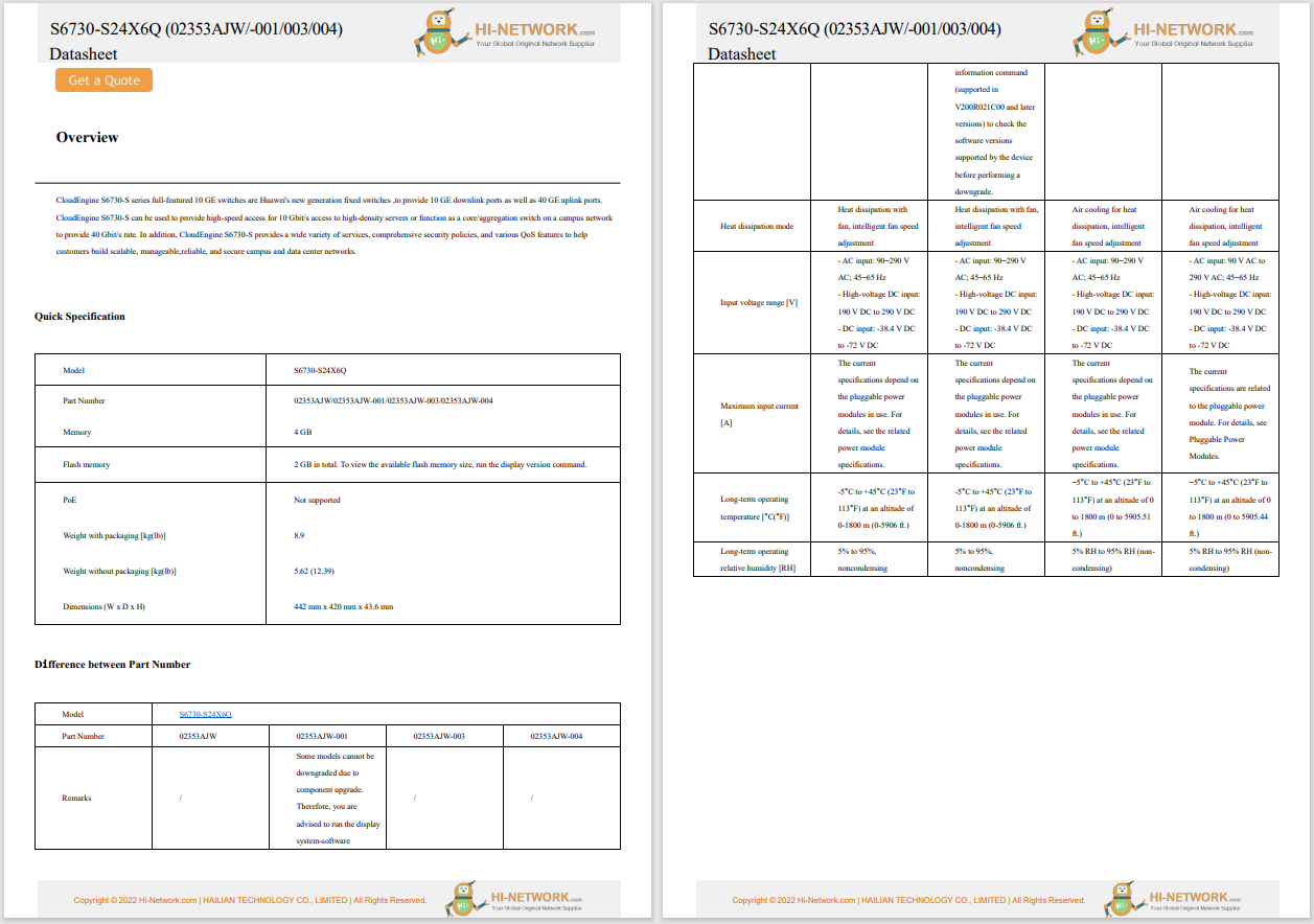
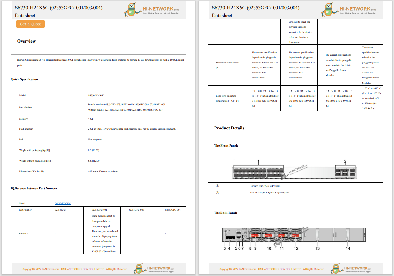
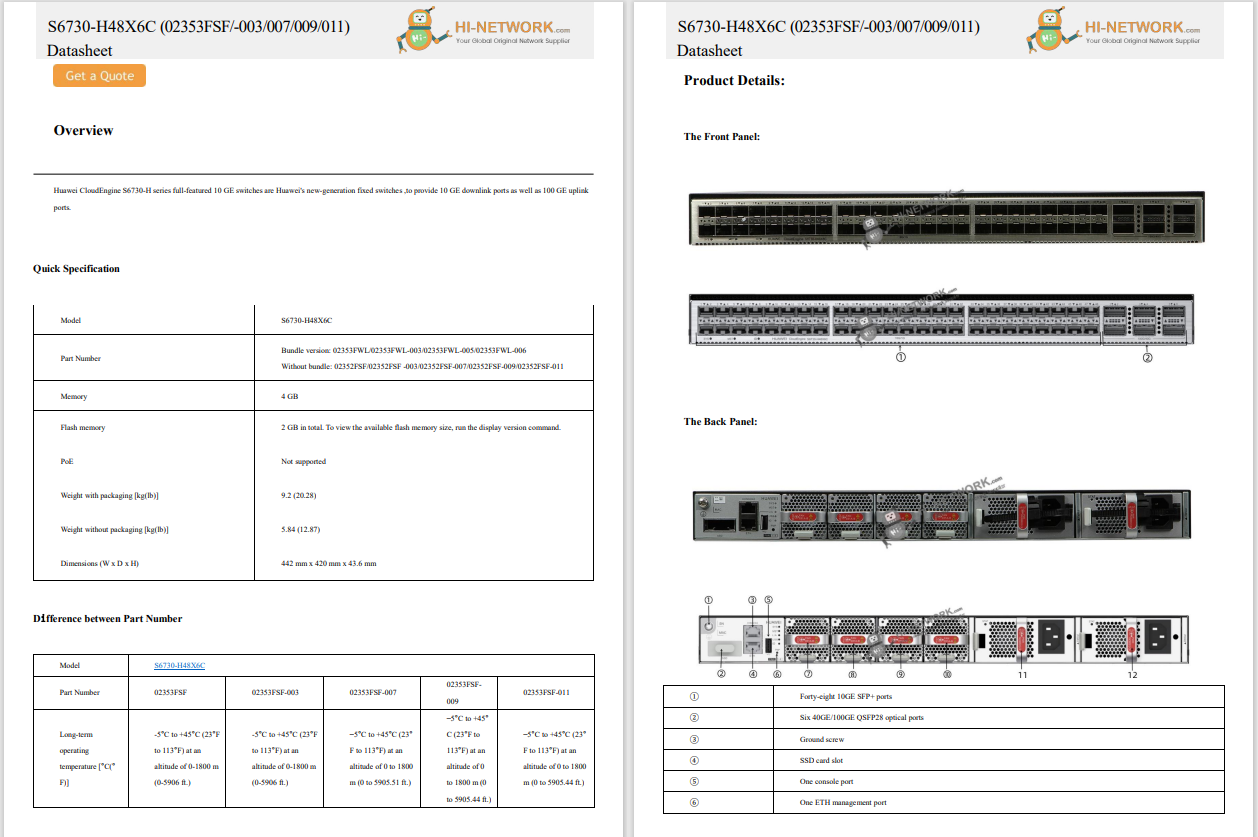
Display (Main Screen) | 7.6-inch Dynamic AMOLED 2X with LTPO (1-120Hz refresh rate) |
Display (Cover Screen) | 6.2-inch Dynamic AMOLED 2X with LTPO (1-120Hz refresh rate) |
Dimensions (unfolded) | 130.1x155.1x6.3mm |
Weight | 263g |
Cameras | 50MP wide, 12MP ultra-wide, 10MP telephoto, 4MP front (inner), 10MP front (outer) |
Processor | Qualcomm Snapdragon 8+ Gen 1 |
Memory and storage | 12GB RAM with 256GB, 512GB, 1TB |
Battery | 4,400mAh |
Durability | IPX8 |
Software | One UI 4.1.1 over Android 12L |
Colors | Phantom Black, Beige, Greygreen, Burgundy |
Price | Starting at$1,799 |
At first glance, the Galaxy Z Fold 4 could easily pass as last year'sZ Fold 3 . That's because Samsung had already done a satisfying job of building a framework that 1) can unfold into a decent-sized tablet, 2) is IPX8 certified for water resistance, and 3) fits snuggly in most, if not all, pockets.
The exterior is still treated with a soft-touch, matte-frosted coating, while polished aluminum streams down the sides, hinge, buttons, and ports. Considering how much grippier glossy textures are than satin ones -- and the side of the phone being our hands' main touchpoint -- I like the industrial design choice here.
The new Greygreen finish is more grey than green.
June Wan/It's only when you take a deeper inspection at the Z Fold 4's slimmed-down bezels, rounded display corners, and ever-so-lighter footprint (8g less than the Z Fold 3, 19g less than the Z Fold 2) that you will begin to notice what Samsung has been working on this past year. While minor, all of these changes are more practical than you would think, especially if you've used previous iterations of the Z Fold and have since become acquainted with the larger form factor.
That's where I currently stand. Switching over from the Galaxy Z Fold 3, the lighter Z Fold 4 has been a familiar, yet more burdenless experience. The less frequent hand and arm strains are telling enough. Samsung says that it managed to achieve such a physical feat by removing a series of metals and plates under the displays and implementing a new, sleeker hinge system.
That's not to say the Z Fold 4 will feel like your smaller iPhone or Android though; it's still a chunky piece of tech. And for all the power and multi-screen features that you get with this device, Samsung seems content with the current state of design.
Also: Best Galaxy Z Fold 4 deals available right now
When closed shut, the Z Fold 4 is 15.8mm thick.
June Wan/The primary reason whyanyoneshould buy a foldable is for its 2-in-1, small-screen-to-big-screen mechanic. The two displays on the Z Fold 4 are Samsung's most refined duo yet, which automatically puts it a rank above our former foldable champion, the Z Fold 3.
On the outer Cover Screen, you get a tall 6.2-inch, Dynamic AMOLED panel that can refresh from 120Hz down to 1Hz. The aspect ratio is a smidge shorter than the Z Fold 3's but still causes the phone to feel more like a TV remote than anything else. Naturally, the keyboard typing experience on the Cover Screen remains a cramped nightmare for folks with larger fingers, so glide typing is the way to go.
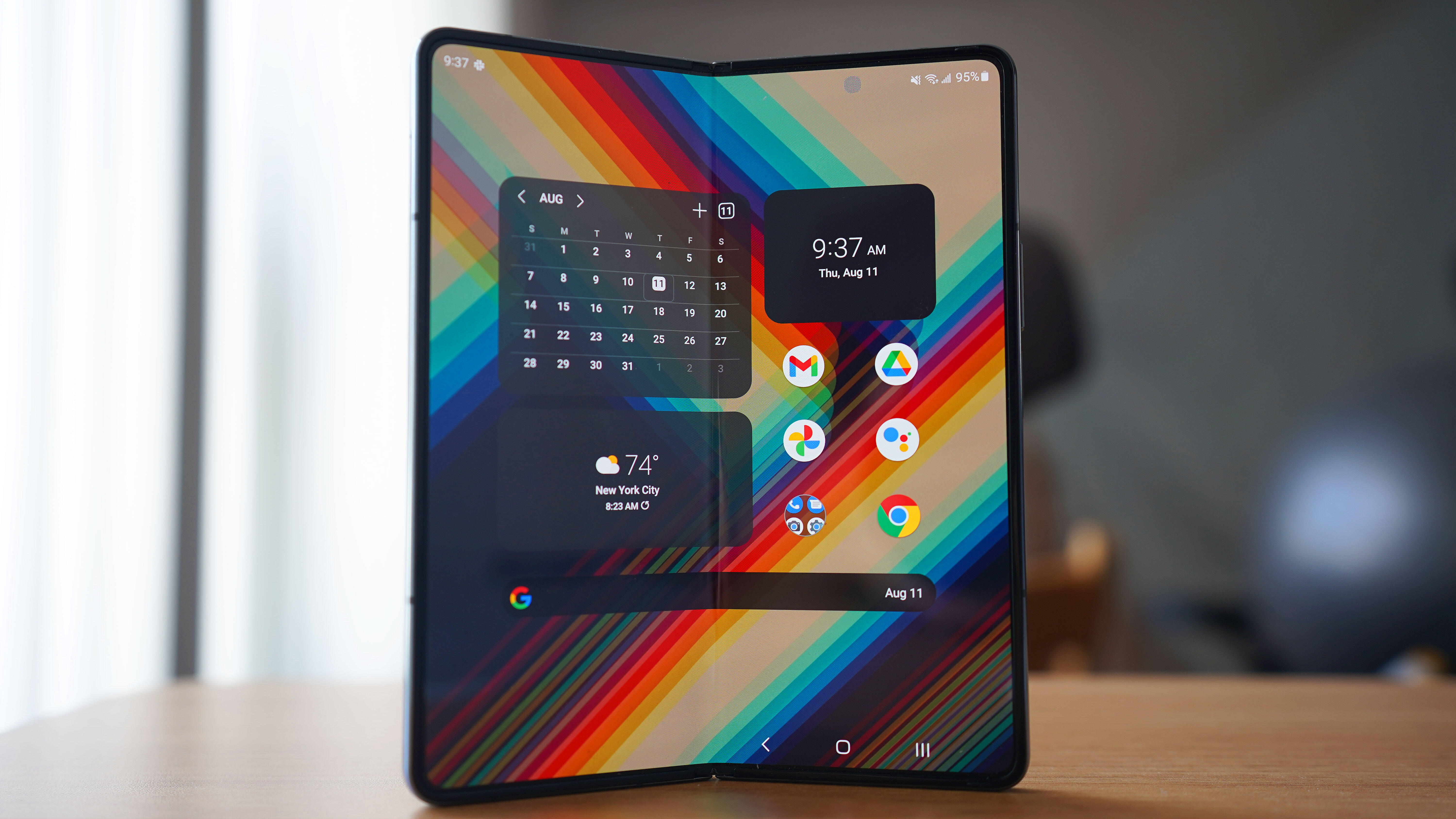
The inner Main Screen, which measures 7.6 inches for all your multitasking and power-user needs, is just as optimized as the outer one. It, too, is boosted by Samsung's Dynamic AMOLED technology, with the ability to ramp up to 120Hz for smooth-scrolling or slow down to 1Hz for still frames. The tablet-like display is just as boxy as the previous generations and that iconic crease still reflects down the center, albeit in a more subtle manner.
The Main Screen is plenty big for media consumption, multi-app browsing, and more.
June Wan/What's impressed me the most with the Z Fold 4's displays is how much brighter they get compared to their predecessors. Samsung claims that both panels now emit 1,000 nits of brightness, more than doubling that of last year's 422. From my past week of meandering between office buildings, the subway, and New York City streets, I can attest to the Z Fold 4's improved visibility. I even found booking an Uber -- which required pinpointing my location on a bustling city map -- a breeze in broad sunlight.
Also: Samsung aims to sell 10 million foldables in 2022
Samsung's new and improved hinge is the heart of the foldable experience. Unlike the last three generations' gear-based construction, the Z Fold 4 takes to a linear, rotation-based approach in order to slim down the thickness and weight of the hinge. I'll have to see how the new assembly holds up over time, including whether the mechanism becomes looser or if it allows for any bubbles and dust to seep through the polymer layering. For now, the hinge has felt as robust and sturdy as ever.
Samsung knows a thing or two about balance and symmetry.
June Wan/Android foldables, at least the phone-to-tablet ones, are basically Android tablets. That means the software setbacks that tech aficionados rightfully call out Google for are just as applicable to the Z Fold's Main Screen format. In an attempt to address this problem, the Z Fold 4 launches with Android 12L, Google's large-screen tailored operating system. The main appeal of Android 12L is the enhancement to apps that typically aren't optimized for bigger displays. There are also a few gestures and design changes that better suit the tablet experience.
7.6 inches is plenty of space to get playful with widgets, apps, and folders.
June Wan/On the Z Fold 4, popular services from Google and Microsoft take on a more desktop-like UI, segmenting different app components across the main 7.6-inch screen in a purposeful and tasteful manner. That's not to say thateveryapp has received the 12L treatment; Instagram and Twitter are still outstretched variants of their standard selves, and you'll have to pray that the less-popular apps are any better.
Also: Why the struggle stays real for Android tablets
Currently, the only solution to the app-sizing problem is by going into the display settings and manually assigning the aspect ratio of apps, whether you prefer it to open in full screen, 16:9, or 4:3 scaling. For cases like Instagram, the more traditional 16:9 sizing should work best.
Within the Android 12L (under OneUI 4.1.1) experience are two new and improved productivity features: Taskbar and Flex mode. The former is similar to the Z Fold 3's side-mounted app menu but is now positioned at the bottom of the screen and contains a row of quick-access apps, two most-recent apps, an app drawer button, and the standard navigation keys. It's similar to iPadOS's Dock feature, which is great in terms of accessibility and ease of use. And there's really no toggle to activate the Taskbar; it just automatically appears when you open an app. Just make sure you're on the default OneUI launcher and not a third-party one.
A new bottom Taskbar keeps your most frequented apps available for quick access.
June Wan/The game-changing aspect is not so much the capacity of the Taskbar, though. It's the ability to snap up to three apps on screen by simply dragging and dropping from the dock. You no longer need to set app pairs or go to your recent apps tray to pick out ones to set for split screen, positioning each app window is as easy as dragging it to your desired area. The Z Fold 4 handles the rest by reorientating the other windows, much like how it would shift widgets and apps when you move those around on the home screen.
I've always found multi-app setups cumbersome and worse to navigate around in, but the new Taskbar is actually intuitive and user-minded. It's a welcoming invitation to open more apps at once.
Flex mode is another recipient of the desktop transformation; it now presents a multi-finger, gesture-based trackpad when you open a stock Samsung application or third-party one (whitelisted via the "Labs" settings) and position one-half of the Main Screen like how you would with a laptop lid. When activated, you're able to browse the upper portion of your Z Fold 4 by tapping, swiping, scrolling, and even pinching in and out on the virtual trackpad.
More: Improved Flex Mode, Taskbar turns Samsung's new foldable into a mini laptop
Clearly, Samsung wants the Z Fold to replace your laptop.
June Wan/Is this a gimmicky feature? Absolutely. Unless you'd like to relive the humble days of netbooks and miniature laptops, you're better off interacting with the Z Fold 4 like the touchscreen foldable that it is.
I went into performance testing with an eye for stutters, lag, and any signs of vulnerability. This is a$1,799 phone after all, and for the expansive feature set that Samsung touts, it'll have to talk the talk and walk the walk.
To my delight, the Z Fold 4 experience has been capable as promised. Apps, one or many, operate smoothly thanks to the Qualcomm Snapdragon 8+ Gen 1 chipset, and the 12GB of RAM is more than sufficient for strenuous tasks. (It's also the only RAM configuration that Samsung offers, so I won't complain about the laptop-grade power management.)
With smartphones, I often notice hiccups when switching between launchers and gesture modes, but that hasn't been the case with this one. Better yet, the same competence goes with loading media-heavy services like Instagram, TikTok, and Twitter, which have videos and images pre-loading in the background. Basically, the Z Fold 4 is doom scroll certified.
Notice the crease or under-display selfie camera?
June Wan/And then there's gaming. If the app (or emulator) supports it, it looks absolutely amazing when stretched across the larger 7.6-inch Main Screen. Titles like Genshin Impact and NBA JAM are immersive and full of vibrancy when broadcasted from edge to edge, and it certainly helps that both the crease and under-display camera are less apparent in this year's model.
My only real callout with performance is longevity. For example, should you crank a game's graphic settings to the max, you'll notice the Z Fold's mere 4,400mAh battery deteriorating by the minute. That's not to say that battery life is any better with regular use. During my two weeks' time, my review unit averaged about four hours of screen-on time before calling it quits.
Disappointingly, the Z Fold 4 doesn't see a noticeable improvement in endurance compared to its predecessor. I would've loved to have seen at least a 5,000mAh capacity built in. For now, Z Fold users -- old and new -- will have to settle with what I consider mid-tier battery life. It's good enough to last you through the work day, but you'll want to charge it for the commute home.
Perhaps Samsung just can't fit a larger battery in the foldable form factor.
June Wan/Speaking of, the Z Fold 4 supports up to 25W of fast charging and can top up from 0% to 50% in about 30 minutes. It's no 120W charging found on some overseas handsets, but it's practical enough for an early morning refuel. A charger is not included in the box (surprise, surprise), and you'll have to purchase acompatible adapter to reach the peak wattage rate.
Also: What is Gallium Nitride (GaN) next-generation charging technology?
If there's one thing that all Galaxy Z Fold users can agree on, it's that Samsung's large-screen foldable has never had a true flagship camera system. For the past three generations, the Z Fold has carried either a year-old lens configuration or one that is inferior to Samsung's Galaxy Ultra line.
Not anymore.
While the Z Fold 4 still houses a triple camera array at the back, the lenses have been upgraded to a 50MP wide lens, a 12MP ultra-wide, and a 10MP telephoto with 30X Space Zoom. Besides the improved field-of-view on the ultra-wide, the new camera system is identical to the one on the Samsung Galaxy S22 Plus, which 's Jason Cipriani couldn't help but praise in his early-year review.
So, how do the new cameras fare? Here's a run-through of each component.
This first shot of the Freedom Tower in New York City was captured with the 12MP ultra-wide lens. In well-lit environments like this, the Z Fold 4 does an immaculate job of pulling in the colors of different objects and shades, while keeping what's at the center in focus. I especially love that the clouds and sky are not overblown or washed out.
In terms of color reproduction, the Z Fold 4 tends to dial up the saturation of images, favoring a more bold and punchy tone than anything else. If you're not much of a photo editor, then the default output from the three lenses should be satisfactory.
The 12MP telephoto lens is not bad either. There's a natural blur between the subject in focus and its background, and the camera accurately crops out what's being captured. In the sample shot below, the Z Fold masterfully keeps the seagull (and even the rock) in focus.
Let's talk about the front-facing cameras as well -- and the bounty of ways you can capture a selfie thanks to the shape-shifting nature of the device. There are four ways you can take a selfie with the Z Fold 4. The first is with the standard front-facing cameras, one on the Cover Screen and another on the Main Screen. Then, there are Flex Mode selfies that turn either the outer or inner screen of the Fold into a preview monitor, so you can leverage the rear cameras for sharper-looking images.
Honestly, for how easy it is to take selfies with the main rear cameras, I'm not sure why the front-facing, under-display camera still exists. Its output remains washed out (see samples below) and a heavy post-processing job is mandatory to make the image passable at best.
From left to right: Viewfinder preview, under-display front camera, and rear camera via Flex Mode.
June Wan/While I've covered the main functions and performance areas of the Z Fold 4, here are several pointers that I jotted down throughout my time of use that I think will be of great interest to serious buyers.
Simply point the rear camera downward and flex the display for painless top-down shots.
June Wan/While it's already been a month with the Galaxy Z Fold 4, I still feel like there's an abundance of features and settings that I've yet to discover. That's sort of the beauty of the Samsung foldable. Evenfor enthusiasts like me, the Z Fold experience is one that keeps giving, with new use cases and software tricks that unravel as you flex the device throughout your daily life.
Even at $1,799 , I wouldn't say go as far as to say that Samsung is overcharging for the device. It's as competent, powerful, and innovative as advertised. And while the Z Fold 4 may not be the mainstream foldable of choice -- that would be the Z Flip 4 -- for consumers who can make use of the expanded form factor, the Z Fold is as good as it gets.
If you're on the fence about the Samsung Galaxy Z Fold 4, these are the best alternatives worth considering:
There is no denying that the best one-to-one alternative to the Z Fold 4 is last year's Z Fold 3. If the former has too high of an asking price for you, then the latter can now be purchased for less than$1,000, which makes it a stellar, large-screen foldable for work and play. While the camera system is a year old (and you'll have to wait for Samsung to patch the new Taskbar feature in), you're basically getting 75% of the Z Fold 4 for much less.
In the case that the Z Fold 4 is too big to handle, check out the more compact Samsung Galaxy Z Flip 4. It's the company's other new foldable and offers a similar dual-screen form factor that reinvents the way you use your smartphone. The Z Flip 4's battery size is not as long-lasting as the Fold, and it certainly doesn't expand as wide, but it's one of the most polished foldable phones you can buy today.
If you came into this season's Unpacked event hoping for a Galaxy Note replacement, then I'm afraid you're months late. While the Z Fold 4 does come with an optional S Pen stylus and case bundle, it's not identical to the integrated experience of the classic Note. Instead, look to the Samsung Galaxy S22 Ultra, which embodies the rectangular slab design of the Note, with an S Pen siloed at the bottom.
 Hot Tags :
Tech
Our process
Smartphones