












Brace yourself, my fellow Android-adoring animal: You're about to experience a whirlwind of conflicting emotions. Ready?
First things first: Google just launched the first official beta version of this fall's Android 13 update! If you've got a current Pixel phone, that means you can download it onto your device this very second and see all the latest and greatest stuff Google's got cookin' up for our future. (Yay!)
Now, for the twist: UnlikemostAndroid betas, this inaugural Android 13 beta release still doesn't have most of the software's key features. It's focused primarily on foundational elements and under-the-hood improvements, and outwardly, it's pretty darn similar to the previews that preceded it. Honestly, it's almost more like another developer preview than a beta - at least, in typical Android terms. (Aww...)
When you step back and think about it, that's probably no big surprise. Google's colossal I/O developers' conference is now a mere two weeks away, and that's the time when Le Google traditionally takes the wraps off its flashiest new Android enhancements. The Android 13 development process started a skosh earlier than usual this year, so wetechnicallyreached that beta milestone sooner than usual - but for all intents and purposes, the big reveal is still ahead of us.
But wait! Don't gettoodisappointed. Thanks to the way Android's created, it's possible to peek inside Google's Android 13 code and get a glimpse at some still-under-wraps elements that are actively being developed. There's no guarantee all of that stuff will make it into the final software in its exact current form, of course - and it's also always possible Google's got more surprises in store that we haven't yet gotten wind of.
But viewed together, these clues paint a pretty cohesive picture of what Android 13 is more than likely shaping up to be. And despite the fact that this week's beta doesn't give us much in the way of tangible new touches, it offers up a tantalizing preview of what's almost certainly right around the corner.
Here, specifically, are three big (and mostly still hidden!) reasons to be excited.
After years of neglecting and basically giving up on the Android tablet form, Google's bringing its focus back to big-screen Android computing in a big way with Android 13.
All signs suggest the Android 13 release will build upon the big-screen optimizations introduced in the awkwardly named (and barely rolled out) Android 12L in-betweener "feature drop" Google worked on right after the launch of Android 12 last fall. And from traditional tablets to expanding foldable phones, Android 13's arrival should usher in some incredibly noteworthy new options.
Specifically, Android 13 will at long last start to optimize the core Android interface for larger screen experiences - erm, again. (Google briefly did this in the Android Honeycomb era of 2011, as the long-time Android nerds among us will recall, but then gave up on that notion a few short years later. Hey, what can we say? Sometimes, Google's just gotta Google.)
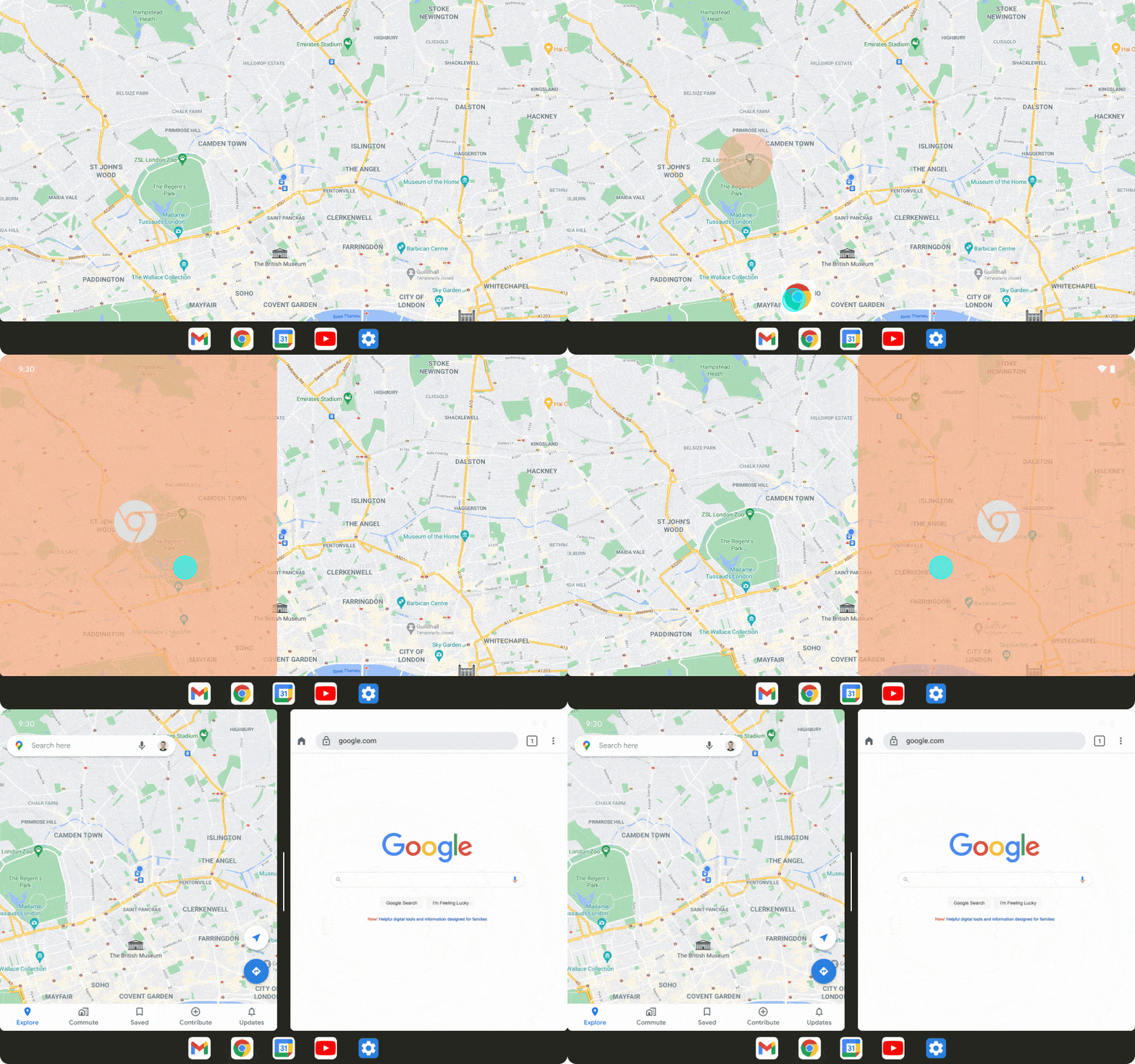
That means when you're using a tablet or a folded-out foldable phone with Android 13, you'll see different elements on different halves of the screen and gain access to some powerful desktop-like multitasking tools - including a clearly Chrome-OS-inspired new taskbar that lets you access your favorite apps from anywhere and even drag 'em up to create an on-the-fly split-screen setup.
 Google
 Some of these concepts first appeared in that Android 12L update we mentioned a minute ago, but that Android version hasn't rolled out to any devices where they're relevant. Android 13 further refines the elements and will mark the first time anyone really experiences 'em in the real world.
And speaking of tablets...
Aside from its core interface improvements, Android 13 is poised to introduce some new tablet-specific features that could change what the term "tablet" even means in our minds.
As spotted by the sharp-seein' sleuths over at Esper, Android 13's code includes loads of material related to a new "hub mode" for large-screen devices. This new feature appears to allow tablets to be treated as shared devices when they're docked - with access to a specific set of selected "communal apps" in that context - and then let multiple users pick the tablets up and sign into their own personal profiles.
As part of that, Android 13 introduces a freshly revamped interface for Android's long-underappreciated multiuser support system. And it includes a souped-up screen saver system that seems to let you add widget-like "complications" into a device's idle-time display in order to make it more info-rich and useful.
All combined, these elements add up to create a whole new kind of use case for Android tablets - one that's easy to see opening up lots of interesting doors both on the home front and in the office and other business environments. It's no wonder Google's so confident Android tablets and Chrome OS tablets can coexist harmoniously and address completely different needs.
Android's notifications have always been one of the platform's strengths and advantages over, ahem, thatothersmartphone ecosystem, but Google's not one to rest on its laurels - and with Android 13, the company's gearin' up to add some powerful extra punch into the Android notification arena.
First, Android 13's early builds already include a crafty new system where you can touch and hold any notification and then drag and drop it onto either side of your screen to create an instant split-screen between the associated app and whateverelseyou were already viewing. You'd never know it was there unless you just happened to try that action, but it absolutely does work.
Especially combined with the taskbar drag-up option we were just talkin' about, this brings Android's long-buried and neglected split-screen feature back into the forefront and makes it feel like a native part of the core interface instead of an awkwardly tacked-on afterthought. It makes notifications even more useful and interactive, too. And it might just turn split-screen into something lots of us actually use.
Beyond that, Android 13 introduces a new notification permission that requires all apps to ask you for permission to send alerts before they're able to do so (in theory, at least; so far, I'm seeing it only with newly installed apps on this first beta). That means by default, no app will ever be allowed to notify you unless you explicitly say youwantto receive its notifications. Sensible, no?
 JR
JR It's a subtle but significant shift that puts the power inourhands and should considerably cut down on needless notification noise.
And remember: All of this is still just scratching the surface. The full Android 13 picture likely won't become clear until Google's I/O conference kicks off on May 11th - and even then, the company could conceivably hold onto some surprises for later in the year, closer to the final Android 13 rollout.
Based on what we're seeing so far, though, there's plenty of reason to get excited - and plenty of reason to watch closely for what comes next in the weeks and months ahead.
Want even more Googley knowledge?Come check out my weekly newsletterto get next-level tips knowledge delivered directly to your inbox - and get three bonus tips on your favorite subject this second.
 Hot Tags :
Smartphones
Operating Systems
Tablets
Google
Productivity Software
Android