













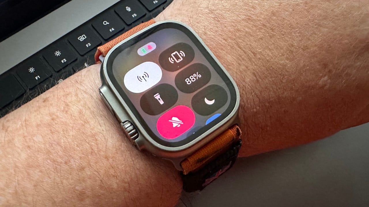
The WatchOS Control Center is home to some of my favorite features
Adrian Kingsley-Hughes/If you've woken up to find WatchOS 10 installed on yourApple Watch , get ready for some changes.
One of the things that I use my Apple Watch for all the time is locating my misplaced iPhone. I must use the ping feature on my Apple Watch several times a week. So much so that it's become muscle memory -- swipe up from the home screen to bring up the Control Center screen and tap the button.
Also: Worried about iPhone 12 radiation? Here's what you need to know
Before switching over to theApple Watch Ultra , I also used to use the Control Center often to enable the flashlight mode.
The problem is that WatchOS 10 changed where this is located. Swiping up now brings up the widgets screen, which is super handy because you can customize them to show you the information that's important to you "at-a-glance" and augment whatever information you have on the watch face.
It's a good feature, but not when you're trying to find your iPhone in a hurry.
Fear not, the Control Center is still available, its position has just been demoted.
WatchOS Control Center.
Adrian Kingsley-Hughes/Now, rather than swiping up, it's a button press -- a single press on the side button.
Phew!
Also: One subtle (but important) reason to buy the iPhone 15 Pro instead of the iPhone 14 Pro
But those of you who have been paying attention and using your Apple Watch feature might recall that a single press on the side button used to bring up the app switcher.
So, where has the app switcher gone?
This has now been moved to live behind a double press of the crown. Now we all just need to retrain our brains to find the things we need in new places.
 Hot Tags :
Tech
Our process
Wearables
Smart Watches